Visualizing temperature change isn't the problem I've ever had with people. It's always been about: "okay, so what does 1.5C mean?"
I think what we need to be using when we talk about climate change are things like projected coastline and population displacement maps.
One of the most powerful facts I've seen recently in Canada was an insurer talking about how some houses simply aren't insurable anymore because they will be flooded again every few years. I want to show people a map of "communities that will be uninsurable by 2050"
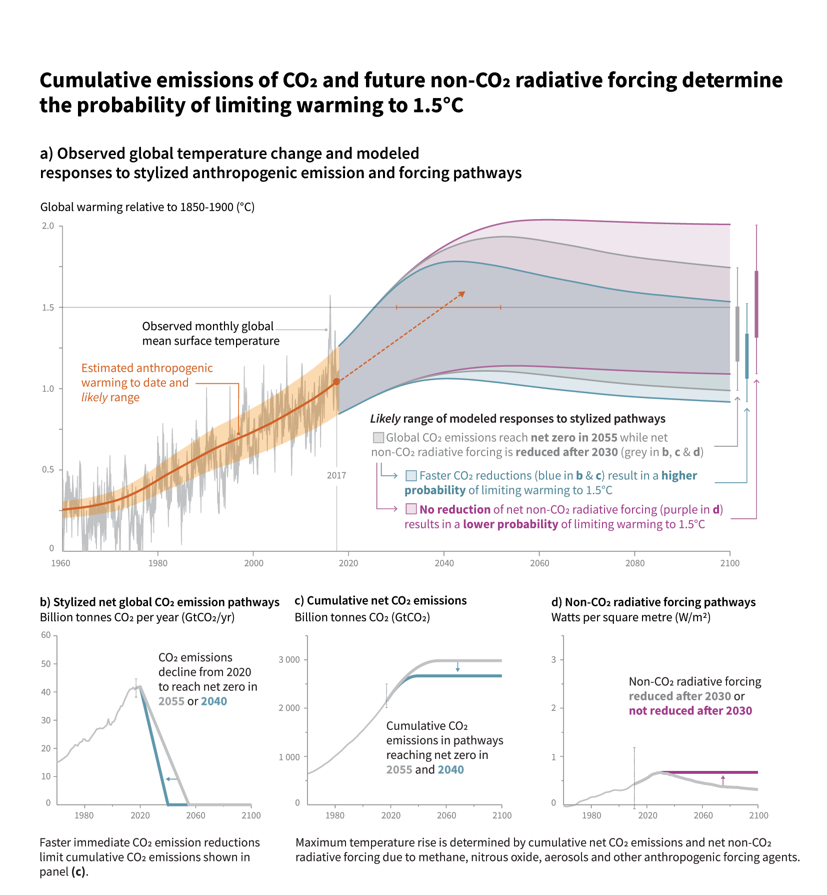
People must understand that increasing 1.5ºC of yearly average of global temperature is not the same as the increase of 1.5ºC in any particular day in their local city.
It is not only not evenly distributed around the world (this chart, and the monthly ones on https://data.giss.nasa.gov/gistemp/maps/index_v4.html gives a different picture), that is the average could well mean 10+ ºC in their particular area in several given days (this week there was like 40ºC in Poland, and there was over 50ºC in India and Vietnam the previous one) while decrease in others, that is not just how they feel temperature, but also what is affected by it in larger areas (more energy to fuel extreme weather events, including the ones that brings extreme cold), and that the regions with the bigger increase in temperature have also several of the possitive feedback loop factors for increasing the global temperature even more.
You don't need 100ºC to get a lethal temperature, with half of that (it is becoming increasingly common), depending on hidration and humidity, a lot of people will die. And you die in a particular place/day, not in a global yearly average, after you are dead doesn't matter if the next week the temperature is bearable. And the food sources that feed billions of people must survive too. And the complex ecosystem that enables that you, and your food sources survive as it is now, even if you are not aware of how something that just got extinct was essential, should survive too.
It kind of reminds me of when stereo manufacturers stopped using RMS power to rate speakers and instead started using peak power. Suddenly your 50W speakers were 2000W and wow that number was really big.
Climate scientists have been using RMS temperatures but it's peak temperatures that people notice.
Is there a good similar chart for daily or monthly maximum temperatures that one could share instead? As you say, people don't understand the problem about 1.5 degrees increase in average indeed.
If temperature regularly exceeds 40°C it will look more threatening to people.
The variance is tricky because of the enormous time range and the huge number of variables. It's also impossible to account for any black swans, positive or negative, that might happen in the next 80 years. We have no idea if some miraculous carbon removing technology will be discovered that saves us all. Or if we're missing some key component to the puzzle and actually we'll be extinct by 2050.
The book “uninhabitable earth” is good for this. As is his talk on the Chris Hayes podcast. Some key points:
2C means genocide. Entire island nations under water and lost.
Every minor increase means exponentially higher costs - many more dead, large swaths of the earth uninhabitable.
4C is something like Hong Kong/Shanghai, and many other parts of th world uninhabitable. Going outside would be fatal within minutes.
The majority of emissions have been released in the last 30 years. All human emissions prior to that point are less than the human emissions from that point. People were talking about climate change back then. People decided to burn more oil.
The map I included there seems pretty optimistic compared to some others I’ve seen. In a recent paper, “Boaty McBoatface” saw faster wind currents increase ocean churn and aided sea warming faster than expected. I’ve taken this to suggest the current ocean raises predicted are under estimates.
The thing with that map is it's absurdly optimistic, as it implies a world entirely happy to have entire populations of other countries and continents to move into yours.
The amount of migration, displacement, rebuilding and major wars that would actually get us to that point is unimaginable.
Uninhabitable Earth is terrifying, and convincing. I thought I had a pessimistic outlook on climate until I read that.
I took it as “this is what would have to happen for the least of us to die”. So yes, optimistic. I also think their projected coastlines are optimistic. I don’t remember seeing so much of the US labeled uninhabitable in other discussions.
Scarily, much of the regions marked in that map as suitable for food-growing is mountainous or tundra. I wouldn’t be optimistic about its fertility and suitability for agriculture – even with optimal climatic conditions.
> I want to show people a map of "communities that will be uninsurable by 2050"
Relatedly, there was a recent story in CBC [1] pointing out that flood maps are due to get updated next year, and the impact it will have on housing prices.
Recent research suggests that flood maps (at least in the US) now and always have understated flood-prone areas by a factor of something like 3x. So those 100-year and 500-year and such flood pronouncements may be equally off, too.
And it's not speculative - it's historical. It shows that decline of 4.5 means basically complete icing of the north North America and puts 1.5 in perspective.
its time to move past slam-dunking on the creationists/anti-vaxers/flat-earthers/climate-deniers and focus on the much harder part: engineering for zero by 2040.
that is within the realm of your next mortgage. your utilities and larger institutions are already financing infrastructure that will be around then.
Reading these headlines is pretty depressing. If you want to do something about it, a paper called Tackling Climate Change with Machine Learning[0] just came out, and under Tools for Individuals a startup called Tomorrow[1] is mentioned. They're actively looking for help to get more integrations to their app to calculate people's personal CO2 emissions.
I think trying to frame this as an issue of personal responsibility, as "turn the lights off when you leave the room to save the world", is not only wrong but actively harmful to doing what is needed: massive, concerted, governmental, action.
Both will be needed - most people in industrialized countries would be shocked by what their driving and flying and eating really is, especially if tied to a $ amount
I found a surprising way to reduce my carbon footprint: I downloaded the music and am playing it locally now instead of streaming it over and over again.
I was listening to music on Youtube pretty much all the time and that amounted to about 35GB of traffic per month in average.
That's 420GB per year and with 7kWh/GB and emissions of approximately 500g/kWh that's a surprising total of roughly 1.5t of CO_2 emissions per year. And a downside is almost non-existant.
Edit: my playlist consists of a small number of songs, so I actually get savings. That would not work when listening to a list that does not actually repeat of course.
There is no way 7kWh/GB is an accurate figure. For example, AWS Oregon region charges you $0.05/GB after the first 150 TB.[1] This page[2] says the current electricity rate of Oregon is 9.8¢/kWh. Assuming AWS is getting electricity at half the price (and making no profit), it can burn 1.02 kWh/GB.
The actual number is most likely lower: AWS has to make some profit, and it's not known for being cheap.
The article talks about the cost of transferring a file from the cloud vs loading it from a local harddrive.
It's not only the amount of energy used for that at the datacenter, it's also summing up all the fractions of power usage per GB of the used fiber connection, the repeaters on this fiber connection, routers, switches, losses in power supplies, energy required for air conditioning the hardware, the phone/cable/mobile infrastructure that also has switches, repeaters, ... until ones own modem, router and computer at the own location that is needing energy to operate.
It really does not matter how much they pay because the market price does not include the actual costs a company imposes on the environment. There is no CO2 Tax, is there?
Ask yourself: How can it be more efficient to stream the same stuff over and over again, wasting CPU cycles on couple of fat machines etc. instead of playing it from a local cache (hard drive, ...). IMHO it cannot be more efficient. It is convenient and it appears to be cheap.
You are right that these companies don't pay the "actual costs" on environmental damage, but that's a separate issue, and not really relevant to the initial claim. If you claim that someone is using 7 kWh or electricity, you had better be prepared to show they actually do. (Besides, consumers don't pay for the environmental cost of building and shipping an SSD from Taiwan, either.)
Companies like Amazon may not care about environment, but they care a lot about saving money, and modern computers can handle a surprising amount of connections simultaneously: it's not like those beefy AWS instances are serving just your music.
The 7kWh figure was not mine. However, I see what the intend of the Thread starter was and I think he is right. Streaming video/music on top of 'AI' (to sell more stuff), security theater and Ad campaigns is just a waste of resources.
/s I would bet Bezos and folks can buy fresh air when it comes to this point. But at least we all could watch Game of Thrones when we wanted to.
It was mentioned in [0], it's actually the higher one of two different sources (I haven't looked at the sources to be honest because that would require actually finding them which I haven't yet):
A Carnegie Mellon University study concluded that the energy cost of data transfer and storage is about 7 kWh per gigabyte. An assessment at a conference of the American Council for an Energy-Efficient Economy reached a lower number: 3.1 kWh per gigabyte.
It's from 2012 and cites numbers from as long ago as 2009 to determine normalized energy intensity. It also combines different numbers in a way that mean you can't estimate how much energy is saved by downloading a gigabyte to local storage instead of repeatedly streaming it. The single largest energy segment in their estimate is actually desktop computers! And it counts the energy used by CPU-intensive scripts along with the energy required by actual data transfer.
Sanity check: Cisco estimates "busy hour" internet traffic at around 3 petabits per second in 2019.
If it took 5 kWh/GB for data transfer during that busy hour, corresponding peak hour electricity use would be in excess of 6.5 terawatts. But that's more electricity than the world can generate in any given hour.
Even if the numbers are way off it is obvious that watching TV or listening music over a packet based protocol is way more energy consuming than any UKW sender can be. UKW scales - streaming does not without more energy because you need more computers.
I'm surprised to hear it takes 7 kWh to transmit 1 GB. My phone consumes only 0.3 kWh a month and I use 1 GB. So the power requirements are very asymmetric.
Ok, I'll bite. Why doesn't the chart in the article concern you?
Let's not get distracted by whether or not someone is correct that downloading 35gb/month of a music has a meaningful effect. That is not the primary issue here.
1 dot per country, regardless of its size or shape, may not be very fair.
Maybe data availability will rig the chart, but perhaps something similar, not grouping countries and continents but similar sized areas by latitude could show a more definite trend.
Even without read-the-thermometer records, tree corings and lake bed sediment samples and a number of other go-out-and-look methods can get pretty useful atmospheric data from the past. I don't know what the resolution would be, but it might fill in some gaps.
One challenge with using things like trees to estimate long-ago temperatures is that you have to build a complex mathematical model to map to temperature, and I'm aware of at least one famous study that got the math wrong, to the point of being potentially suspicious. (But I haven't studied this stuff enough to know whether or not other proper studies exist)
> One challenge with using things like trees to estimate long-ago temperatures is that you have to build a complex mathematical model to map to temperature
As it turns out, that's what you have to do with fairly recent temperatures measured with thermometers that aren't located in the same places, too.
It has been pointed out that tree rings respond mostly to changes in precipitation rather than temperature. If you can properly compensate for that, and for various other potentially confounding factors, then maybe you can derive some proxy temperature data from them. Other proxies have their own problems too, of course.
That's the project that was started by a physicist that didn't trust the numbers previously in the field, and basically called climate scientists amateurs, and set out to show them how they're all doing it wrong.
What happened in the end was he just recapitulated exactly what climate scientists had been saying all along, so he had to trumpet "oh but it's never been done this precisely," just glancing over all the damage he had done to the credibility of the field with his completely unfounded doubt.
Replication is great, and I'm glad Berkeley Earth is still at it.
But we need to start holding people accountable for their predictions on this matter. If somebody is filled with unfounded doubt, why the hell should we listen to them until they've actually done the work to provide data?
If you haven't even bothered to check sources but want to parade around how you think the data is untrustworthy, data which you haven't even sourced much less evaluated, why should we listen to such data-free and evidence free speculation that has proven to be wrong every time is has been evaluated?
If somebody is skeptical of climate scientists at this point in history, it says a lot about their inability to evaluate technical matters and their ability to form unfounded opinion when there is no need for unfounded opinions. That reflects extremely negatively on the technical capabilities of a person.
That's mighty big talk for someone who probably has done little to no due diligence on the data themselves. But I have, and here's just some of what I've found, specifically in reference to Berkeley Earth (BEST):
1. The initial BEST report (I haven't really looked at later ones) had some remarkable things buried down in the footnotes which, if taken at face value, put everything else they had to say in serious doubt.
2. If I go to their web site and look at the temperature data for my local area, it's obvious that the first 100 or so years of that data is basically fake. I happen to know from previous research that there are no local temperature records going back that far, and if you pay attention to the details they admit as much themselves.
3. Furthermore, I've lived in this area for over 40 years now, and during that time it just so happens that I've experienced both near-record highs and lows for the area - the hottest and coldest that I've ever been in my life. Yet those highs and lows don't show up in the Berkeley charts, which leads me to believe that the whole data set that they're using is basically garbage.
4. If I generate a "Stripes" report for my area, it looks little to nothing like the regional/global stripes reports currently being bandied about.
5. Last but not least, not long ago a researcher publicly pointed out (in considerable detail) the generally remarkable lack of quality control of various climate data sets, on which Berkeley (among others) depends. And he was immediately attacked by Steven Mosher, one of the main Berkeley guys. But Mosher was so anxious to try and discredit the guy that he apparently didn't read the new report too well before trying to point out "obvious mistakes" in it. For example, he (Mosher) used the wrong date ranges, the wrong filtering criteria, and so on in his critique - not the same ones that the report itself was actually using - and this was quickly pointed out to him. (The "problems" that he pointed out mostly went away if you used the correct criteria.) So Mosher was the one who ended up with egg on his face, and I don't think he ever properly apologized for this, either.
But rather than just take my word for such things, you should probably go do some looking for yourself.
Go here to look at Berkeley temperature charts for your area; read through all of them, and pay attention to the details:
http://berkeleyearth.lbl.gov/city-list/
I find it interesting how the warm years in the rest of the world seem to correspond to cold years in europe. The strange deep cold of early WW2 in Europe is also interesting.
Very interesting indeed. WW2 cold: It would be interesting to know if this was a result of the increased dust in the air because of the war or just pure randomness.
This is quite a well-studied period that was probably linked to a large El Niño event - the climate cycle associated with shifting pressure patterns and a weakening of the trade winds in the Pacific.
The world warmed, apart from Europe which had a deep cold spell. And it probably had an impact on the outcome of WWII. The harsh winters at the time frustrated Hitler's armies as they invaded the Soviet Union.
There is no chance your individual actions will have any impact. Our only hope is drastic, large scale policy changes at the national and international level.
I've used a similar compartment plot as a way of evaluating fMRI quality, and how different preprocessing routines affect it. Compartments determined by structural masks, eg white matter, gray matter, cerebrospinal fluid, etc.
I think what we need to be using when we talk about climate change are things like projected coastline and population displacement maps.
One of the most powerful facts I've seen recently in Canada was an insurer talking about how some houses simply aren't insurable anymore because they will be flooded again every few years. I want to show people a map of "communities that will be uninsurable by 2050"